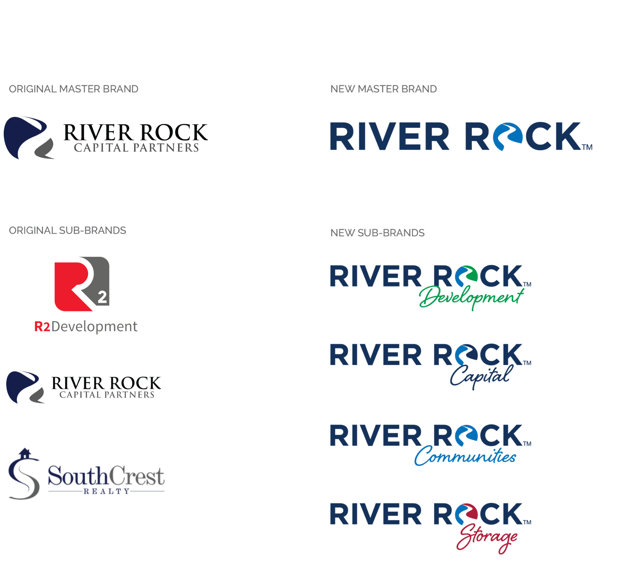
(Mooresville, NC – June 8, 2021) River Rock, a proven leader in residential single and multi-family communities, has recently undergone a holistic rebranding of their corporate parent brand, “River Rock Capital Partners,” as well as its subsidiary brands.
Their former brand, River Rock Capital Partners, had grown and evolved over the past 12+ years from a capital investment services firm to a vertically integrated reals estate asset management firm consisting of real estate development, both horizontal and vertical construction and asset management brands including Dalton Building Group (construction), R2 Residential (development) and SouthCrest Realty (real estate). A collection of non-cohesive brands created a watered-down brand identity over time. The goal of rebranding was to leverage the strength of their overall offering by creating a visual umbrella that would align all of their subsidiary brands under a more unified identity.
River Rock’s agency, Moving Ideas, created a “living” brand architecture for River Rock that would be flexible and able to grow with the company’s future growth. The refreshed River Rock logo is contemporary with a modern, clean, san serif typography. A built-in logo mark, “O,” which is designed with an R-shaped river is representative of the River Rock name that has been simplified from the original River Rock Capital Partners graphic.
By adding the descriptive title below the River Rock master brand, the individual identities are distinct and easily identifiable by their unique secondary color. For example, “River Rock Development” features the word “Development” in River Rock’s brand green. The font for all of the secondary titles was intentionally designed to be more human and provides an impactful contrast to the simplistic primary font of the words, River Rock.
Additionally, “River Rock Communities” and “River Rock Storage” were established to align their most recent retail/rental communities as well as a new storage solution.
